Hasty Charts
September 2020
I recently got to work on an email campaign where I had to send emails to our users with their monthly usage statistics.
I wanted to show the stats in a pleasing visual format instead of dull numbers. So I turned to charts!
After lots of twists and turns, I ended up creating my own function to render charts.
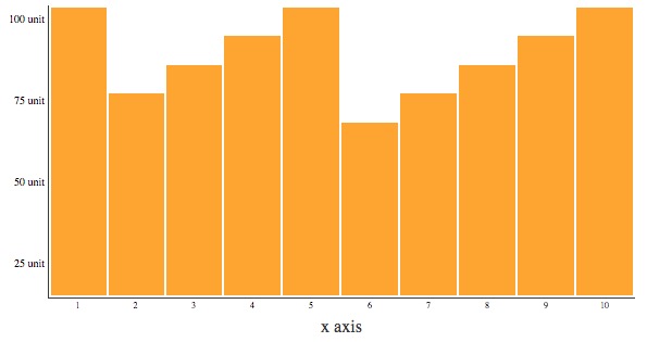
This is how the chart looks with sample data:
Check out the code Gist Link: